How To Use Flexbox
display: flex — establishes the flex container (readies the flex box for future flexbox settings)
flex-direction:
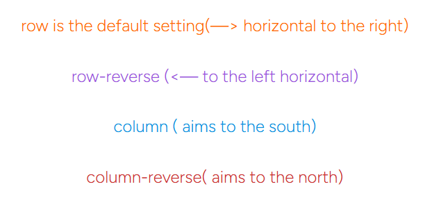
Flex direction determines where flex items are placed in the container. flex-direction is used when you want to determine rather something is aligned vertically or horizontally
flex-direction: row — this is the default setting. a lot of times there is no need to set this. It aligns the elements horizontally along the x-axis
All flex-direction settings
flex basis–this has a higher specificity rating than width. It is like the new version of setting the width. When flax basis is used, the normal width setting is ignored. But it doesn’t ignore min-width and max-width values. When the focus is vertical instead of horizontal, it will deal with height.
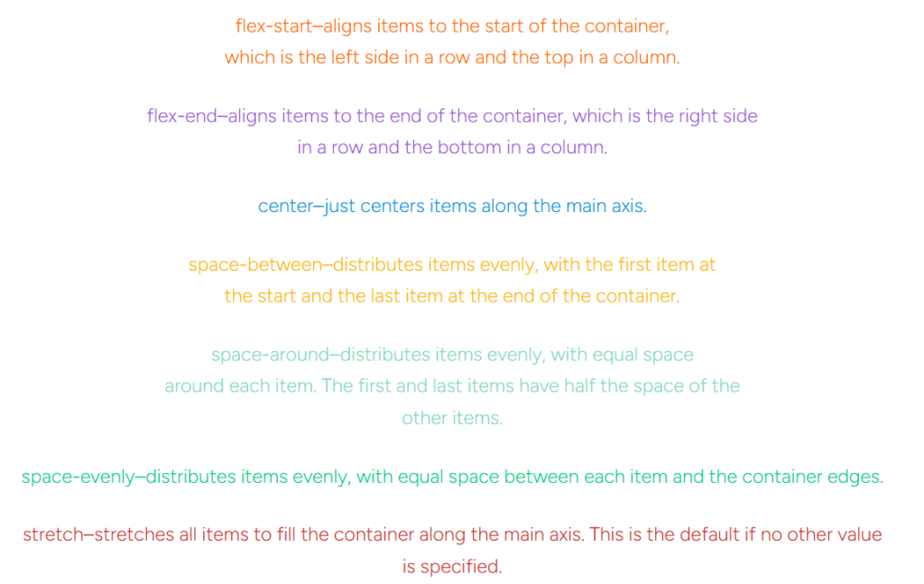
justify-content–this is used to define the alignment of flex items along the main axis of a flex container. The main axis can be either a row (horizontal) or a column(vertical), depending on the value of the flex-direction property.
All justify-content settings
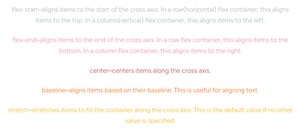
align-items–used to align flex items along the cross axis of a flex container. The cross axis is perpendicular to the main axis, which is determined by the flex-direction property.
Align-Items Flex Direction Properties
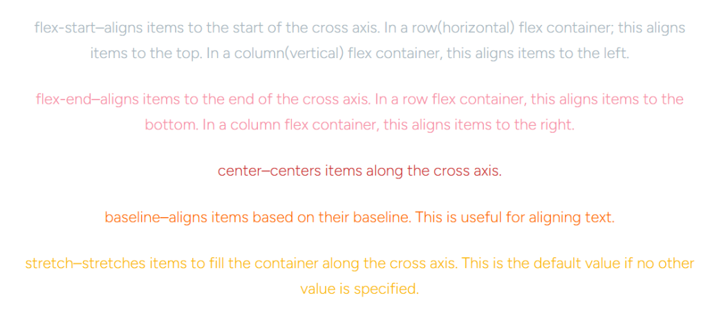
align-self–used to align a specific flex item along the cross axis of its flex container, independently of the alignment defined by the align-items property on the flex container.
All Align-Self Properties
align-content–is used to distribute space between and around flex lines when there is extra space along the cross-axis, which is the axis perpendicular to the main axis. This property is similar to align-items, but whereas align-items affects individual flex items on the cross-axis, align-content affects the space between and around multiple flex lines.
Align-Content Properties
It only applies when there is more than one line of flex items (i.e., when flex-wrap is set to wrap or wrap-reverse).
It controls the distribution of space in the cross-axis direction, which is the vertical direction in a row-direction flex container, and the horizontal direction in a column-direction flex container.
The align-content property can take several values:
1. flex-start: Aligns the flex lines to the start of the flex container’s cross-axis.
2. flex-end: Aligns the flex lines to the end of the flex container’s cross-axis.
3. center: Centers the flex lines along the cross-axis.
4. space-between: Distributes the flex lines evenly within the flex container along the cross-axis, such that there is a half-size space at the start and end of the flex container.
5. space-around: Similar to space-between, but the spaces between the flex lines are equal, and there is also a half-size space on either end of the flex container.
6. space-evenly: Distributes the flex lines so that the space between each line and the flex container edges is equal.
7. stretch (default): If the flex lines don’t fill the flex container, this value stretches the lines to fill the remaining space along the cross-axis.
flex-grow–specifies how a flex item should grow relative to the rest of the flex items in the flex container when there is extra space available along the main axis
Flex-Grow Properties
Default Value: The default value of flex-grow is 0. This means that the flex item will not grow to take up any available space beyond its initial size.
Equal Distribution: If all flex items have the same flex-grow value (for example, all set to 1), any available space will be distributed equally among them.
Proportional Growth: If one flex item has a flex-grow value higher than the others, it will grow more than the others in proportion to its flex-grow value. For instance, if one item has flex-grow: 2 and another has flex-grow: 1, the first item will grow twice as much as the second one when extra space is available.
Value: The value of flex-grow is a positive number (without any units). This number determines the proportion of available space the flex item should take relative to the other flex items.
Usage: It’s often used along with flex-basis, which specifies the initial size of the flex item before any available space is distributed, and flex-shrink, which controls how the flex item shrinks if there isn’t enough space.
flex-shrink–determines how a flex item should shrink relative to the rest of the flex items in the flex container when there isn’t enough space on the main axis to accommodate all flex items at their default or current size.
Flex-Shrink Properties
Default Value: The default value of flex-shrink is 1, which means that flex items will shrink if necessary to fit into the flex container.
Preventing Shrinking: A value of 0 for flex-shrink indicates that the flex item should not shrink, regardless of the available space in the flex container.
Shrinking Proportion: The flex-shrink value is a positive number without units, which acts as a multiplier for the amount of space the flex item will relinquish when the container is not large enough to hold all flex items at their current size.
Relative Shrinking: If all flex items have the same flex-shrink value, they will shrink equally. However, if the values differ, the item with the higher flex-shrink value will shrink more than others.
Shrink Rate: The actual rate at which a flex item shrinks is also influenced by its flex-basis property. The flex-basis property defines the initial size of the flex item before any shrinking occurs.
Usage: It’s often used in conjunction with flex-grow and flex-basis to control the layout of flex items within a flex container, ensuring that the items fit within the available space.
order–specifies the order in which flex items are laid out in their flex container. By default, flex items are laid out in the order they appear in the HTML source code. However, the order property allows you to change the visual order without having to change the actual order of the elements in the document.
Order Properties
The order property accepts integer values (..., -3, -2, -1, 0, 1, 2, 3, …), where:
A larger value means the element will be ordered later (further to the right or bottom, depending on the flex direction).
A smaller value means the element will be ordered earlier (closer to the left or top).
A value of 0 means the element will use the default order, which is the order in which the elements appear in the source code.
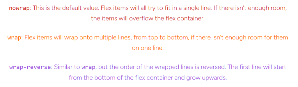
flex-wrap–specifies how flex items should behave when the space in the flex container is insufficient to hold all flex items in a single line. It controls whether the items are forced into a single line or allowed to wrap onto multiple lines, and the direction in which the lines are stacked.
Flex-Wrap Properties
Flex-Basis In More Detail
flex-basis is a property that defines the initial main size of a flex item before free space is distributed according to the flex factors. It is one of the three main properties that control the layout of flex items, along with flex-grow and flex-shrink.
1. flex-grow: This property specifies how much the flex item will grow relative to the rest of the flex items in the flex container when there is positive free space (i.e., the container is larger than the total size of the flex items). A flex item can grow if its flex-grow factor is greater than 0.
2.flex-shrink: This property specifies how much the flex item will shrink relative to the rest of the flex items in the flex container when there is negative free space (i.e., the container is smaller than the total size of the flex items). A flex item can shrink if its flex-shrink factor is greater than 0.
3.flex-basis: This is the property that determines the initial size of the flex item along the main axis before any available space is distributed. The flex-basis can be set to several different values, including:
- A specific size (e.g.,
20px,5em,15%). auto: The browser calculates the size of the flex item based on its content.content: Similar toauto, but it may trigger wrapping if the content is too large.
The shorthand flex property allows you to specify flex-grow, flex-shrink, and flex-basis in one declaration. For example:
.flex-item { flex: 1 1 10px; /* This means flex-grow: 1, flex-shrink: 1, flex-basis: 10px */ }
Some CSS Shorthand Properties
Flexbox shorthand properties are a way to simplify the syntax and reduce the amount of code you need to write.
Some good resources for flex-box reference: